
Emily de
Molly ~ Purity
Described as
a dusty purple base with a subtle pink/copper/gold shifting shimmer and
iridescent flakes
"Purity" is part of a monthly nail polish
collaboration box called "For The Love Of Polish". Pahlish and
Polished For Days are in the box every month, the third maker changes and for October
2019 it was Emily de Molly that was the third polish in the box.
The formula was good and the polish covered in two
coats on my nails. I was actually surprised that it covered in two coats - I
had expected it to be a three coater, but it wasn't. The drying time was really
good.
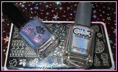
The ugly sweater stamp is from the stamping plate
"Celebration BPX-L008". I stamped with Color Club's "Harp on
It", which is my favourite silver holo to stamp with.

I think I should have stamped with white instead, then
the reindeers would have been more obvious.

This is "Purity" alone; two coats and a
layer of topcoat. The flakies are pretty but the colour is a bit too dusty for
my likings.
 |
| Emily de Molly ~ Purity |
This is the stuff I used today.
Links to the other two polishes in the box (as I put
them up):
Polished for Days: Monster Mash
Pahlish: Lycanthrope
Number of
coats: 2
Drying time: Really good
Drying time: Really good
Finish: Jelly
with flakies and shimmer
Overall impression: The flakies are super pretty. The colour is not spot on for me, it's too dusty.
Overall impression: The flakies are super pretty. The colour is not spot on for me, it's too dusty.
Buy again: I
don't think so
Purity is an odd looking polish I think, not sure I really like it :-|
ReplyDeleteI do think the stamping makes it look a bit better!
Gotta be a first, one of your polishes I don't really like :-O
:O !!
DeleteI wouldn't have bought it alone. I think it might look better with a darker stamping polish over it!
This nail polish looks like it's "alive", something like the ocean, that's my impression... and I like it! :-)
ReplyDeleteYes, on this kind of polishes it's always better to use white or black, something that could contrast the base colour and pop-up nicely! :-)
That's what I'm going to do next time for sure :)
Delete