OPI ~ Kiss me at Midnight
& It’s Frosty Outside
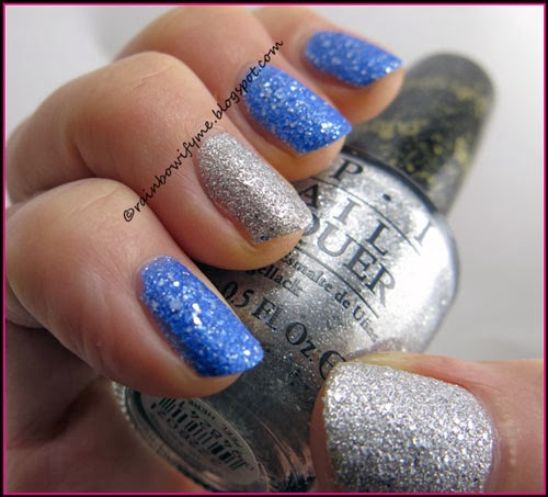
Blue with silver glitter
& Silver with silver glitter – both liquid sands
I bought these two polishes, which are both from the Mariah Carey
holiday collection of 2013,
in New York.
I usually buy my OPI polishes on evilBay, but it was nice to be able to
actually see the polishes in real life before buying them. If I had only looked
up on-line swatches, I probably wouldn’t have bought the silver, so I’m glad
that I got to see them "in the flesh" first.
One of the problems with seeing colours/swatches/manis
online is that a few people enhance them, to make them look nice in their
blogs. That’s bad style, and is telling the rest of us visual lies. I’ve seen
them (we all have) and have sometimes been disappointed when I’ve subsequently
bought the product, having been ‘turned on’ by the visuals. Well – it’s not the
product’s fault, it’s the bloggers who enhance the colours, to make us viewers
think their fingernails look better than they really do. Don’t let your ego get
in the way of a supposedly factual review! Nobody will respect you or your
blog, when they actually get to see in real life the product you’ve enhanced to
pretty up your post(s).
Here’s an example : I was sent a polish to review, and
of course checked around to see what other info was out there about the target
polish. I found another review of the exact polish I had in my hand, and girls
– those other review pics were nothing like the-polish-in-real-life. I
continued and applied "my" polish, and finished & published my review.
Many times I’ve looked at the "other" review and –
because I’m good with Photoshop myself, it’s part of my real-world job – I
can tell that it had the colours & tones majorly enhanced, the fingers were
cleaned up (although nothing wrong with that per se) and the whole post
presented the polish in a totally false light - although admittedly it looked
very pretty indeed. If I’d have purchased on-line, on the strength of that
other review, I’d have thought I’d received a totally different polish.
Let’s not forget that when we make review posts and
show off our pretties, others are judging the product to see if they want to
buy it – and they will not be happy with us if they find that we’ve played with
the reds and blues etc. to make it look pretty on our fingers, and by doing
that, have taken away the trueness of the polish.
Anyway. Rant over, and movin' on: I applied two layers
of each of today’s polishes on my nails. The formula was really good and the
drying time too! It actually covered after the first coat, but the second coat
made it just a little bit better and totally worth it.
Take a look what two layers and no topcoat look like:
I love that there’s silver glitter in the blue, and also bigger chunks
of silver, in the silver!
Then I stamped on it. I used Essence’s “I’m a Marine Girl” from their
(now old) 50’s Girls Reloaded collection. I used a motif from my Apipila02
stamping plate. And here’s what that end up looking like:
If you take a closer look, you can see that there’s a blue stamp on the
pinkie too! That was a mistake I made because I stamped without thinking! It
actually looks pretty cool, so I decided to just leave it like that!
I have got a new XL stamper, and this is the first time I’ve used it.
It’s not as squishy as the old one - and it feels as if it isn’t just as easy
to pull on the stamps, or squash out the broader parts of some designs. I hope
that I’m going to like the new one more than I liked the old one. I never quite
became friends with the old one. Like stamping with a fat ol’ caterpillar!
Here are the three polishes I used. Look at all the silver glitter in
the blue OPI; I really like that!
That’s today’s mani for you. I hope you like it as much as I do!
Opacity: 9/10
Colour, prettiness: 9/10
Durability: 8/10
Value for money: 8/10
Overall: 8.5/10
Buy again: Yes