
OPI ~ Kiss me at Midnight
& It’s Frosty Outside
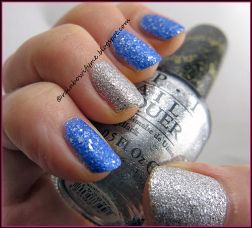
Blue with silver glitter
& Silver with silver glitter – both liquid sands
I bought these two polishes, which are both from the Mariah Carey
holiday collection of 2013,
in New York.
I usually buy my OPI polishes on evilBay, but it was nice to be able to
actually see the polishes in real life before buying them. If I had only looked
up on-line swatches, I probably wouldn’t have bought the silver, so I’m glad
that I got to see them "in the flesh" first.
One of the problems with seeing colours/swatches/manis
online is that a few people enhance them, to make them look nice in their
blogs. That’s bad style, and is telling the rest of us visual lies. I’ve seen
them (we all have) and have sometimes been disappointed when I’ve subsequently
bought the product, having been ‘turned on’ by the visuals. Well – it’s not the
product’s fault, it’s the bloggers who enhance the colours, to make us viewers
think their fingernails look better than they really do. Don’t let your ego get
in the way of a supposedly factual review! Nobody will respect you or your
blog, when they actually get to see in real life the product you’ve enhanced to
pretty up your post(s).
Here’s an example : I was sent a polish to review, and
of course checked around to see what other info was out there about the target
polish. I found another review of the exact polish I had in my hand, and girls
– those other review pics were nothing like the-polish-in-real-life. I
continued and applied "my" polish, and finished & published my review.
Many times I’ve looked at the "other" review and –
because I’m good with Photoshop myself, it’s part of my real-world job – I
can tell that it had the colours & tones majorly enhanced, the fingers were
cleaned up (although nothing wrong with that per se) and the whole post
presented the polish in a totally false light - although admittedly it looked
very pretty indeed. If I’d have purchased on-line, on the strength of that
other review, I’d have thought I’d received a totally different polish.
Let’s not forget that when we make review posts and
show off our pretties, others are judging the product to see if they want to
buy it – and they will not be happy with us if they find that we’ve played with
the reds and blues etc. to make it look pretty on our fingers, and by doing
that, have taken away the trueness of the polish.
Anyway. Rant over, and movin' on: I applied two layers
of each of today’s polishes on my nails. The formula was really good and the
drying time too! It actually covered after the first coat, but the second coat
made it just a little bit better and totally worth it.
Take a look what two layers and no topcoat look like:

I love that there’s silver glitter in the blue, and also bigger chunks
of silver, in the silver!
Then I stamped on it. I used Essence’s “I’m a Marine Girl” from their
(now old) 50’s Girls Reloaded collection. I used a motif from my Apipila02
stamping plate. And here’s what that end up looking like:

If you take a closer look, you can see that there’s a blue stamp on the
pinkie too! That was a mistake I made because I stamped without thinking! It
actually looks pretty cool, so I decided to just leave it like that!

I have got a new XL stamper, and this is the first time I’ve used it.
It’s not as squishy as the old one - and it feels as if it isn’t just as easy
to pull on the stamps, or squash out the broader parts of some designs. I hope
that I’m going to like the new one more than I liked the old one. I never quite
became friends with the old one. Like stamping with a fat ol’ caterpillar!

Here are the three polishes I used. Look at all the silver glitter in
the blue OPI; I really like that!

That’s today’s mani for you. I hope you like it as much as I do!
Opacity: 9/10
Colour, prettiness: 9/10
Durability: 8/10
Value for money: 8/10
Overall: 8.5/10
Buy again: Yes
Colour, prettiness: 9/10
Durability: 8/10
Value for money: 8/10
Overall: 8.5/10
Buy again: Yes
Hear, hear!!
ReplyDeleteI think we all have been lured into buying a polish after seeing gorgeous swatches presenting it way more beautiful that it is in real life - and that is so annoying.
But when it comes down to it a lot of people have computer screens that are not correctly color calibrated, and to see the true color, that is the first thing you need to sort out. Both if you want to present a color true and see it true.
Secondly a lot of people do not try to - or know how to - work with photo editing.
Personally I spend a lot of time correcting a color, if my camera didn't capture it the correct way, and if I do not succeed I always tell the readers so, so that they know...
Because I agree, showing swatches true to the color is the most important thing!
OK, and you manicure is gorgeous, I love that shade of blue!!
I totally agree that the colour calibration of the monitors also have an influence on this, but I kid you not: I've seen three different pics of the same polish, and there's no way that I think it's the same!
DeletePlus what with girls without any wrinkles on their fingers? Some Photoshop their fingers so much that they wouldn't be able to bend their fingers if they looked like that in real life, hahaha!!
LOL I think some light boxes does give those weird fingers that look plastic like, usually also the skin tone is very weird.
DeleteAnd yes, I know about the multiple different shades show of the exact same polish, I have found some colors like pink, mint, teal and lavender really often come out differently and often extremely different from what they look like in person...
Try googling Chanel Organdy choosing photos, and you will see what I mean, the links from me are pretty color true, but on so many others it looks like a hot pink, I remember how disappointed I was to see it in person LOL
I get creeped out by those photoshopped fingers! Some of them look like they photoshopped the color onto their nails as well, yuck!
DeleteI've spent a LOT of time trying to perfect my way of photographing in my light box (and in other lighting settings too) to minimize my use of Photoshop. Because honestly, wouldn't you want to spend a little bit more money and time working on your light box and technique than spend an hour working on each picture in Photoshop? I usually make the picture a little bit lighter, and I remove cuts from my fingers (I have pets with sharp claws). That doesn't really change the look of the polish, in my opinion. I don't mess with the color settings because my camera does a pretty good job of getting the right color. Although I do agree that some pinks and blurples are hard to get right.
Different monitor settings make it hard to know what the color actually is, but just to make it as close as possible, I keep a swatch stick next to my pictures so the color stays as true as possible.
Thanks for speaking out, and I absolutely LOVE your mani!
It's not just the colours of the fingers (which I admit can be really odd and weird), it's also the fact that the lines where we bend our fingers are being erased, and what's the point of that?
DeleteI don't mind that people correct the colours in Photoshop if they do it to make the colours look like they look in real life. But I do mind if it's used to make the polish look better. It's cheating and luring people into buying something they don't know the true nature of. And for what? Not for profit - but out of vanity. No thanks!
Thanks for backing me up on this, girls, I am glad I'm not the only one that feels like this!
More wonderful liquid sands from OPI <3
ReplyDeleteI so need to buy the blue one at some point :)
Love the design btw :)
The blue is just fabulous, I love the chunks of silver in it! :) And thanks! :)
Deletei agree with your rant! i do not alter the color on my photos but then again my photos are crappy so they sometimes dont look color accurate! lol :( bad Lydia!
ReplyDeletegorgeous polishes btw! love the blue on the most.
The blue is also my favourite of the two, even though I was very positively surprised over the silver :)
DeleteI totally did an entire rant about this and got quite a few hate comments back. I think it's cheating and fake and not something I will ever do. So I'm with you big time!
ReplyDeleteThank you! I have another rant coming up - it's nice to get things off the chest and say them out loud. I haven't had any hate comments yet, but then again, you've got more followers than me :)
Delete